
Interactive Tutorial
How to Create Charts in Excel
Learn How to Build and Customize Charts in Excel to Visualize and Present Your Data Clearly
-
Learn by Doing
-
LMS Ready
-
Earn Certificates

Try this Course with a Free Trial
Charts are a great way to share data and information in a graphical way. The foundation of charts is the data they illustrate. Choosing the right data is the first and most important step in creating a chart.
Choose the Right Chart
Once you've determined the results you want your chart to display, choose the chart that best suits this purpose. The most popular charts are column, line, pie, and bar charts.
| Chart Types in Excel | |
|---|---|
 Column Column |
Column charts are used when you want to compare different values vertically side-by-side. Each value is represented in the chart by a vertical bar. If there are several series, each series is represented by a different color. |
 Line Line |
Line charts are used to illustrate trends over time. Each value is plotted as a point on the chart and is connected to other values by a line. Multiple items are plotted using different lines. |
 Pie Pie |
Pie charts are useful for showing values as a percentage of a whole. The values for each item are represented by different colors. Limit pie charts to eight sections. |
 Bar Bar |
Bar charts are just like column charts, except they display information in horizontal bars rather than in vertical columns. |
 Area Area |
Area charts are the same as line charts, except the areas beneath the lines are filled with color. |
 XY (Scatter) XY (Scatter) |
Scatter charts are used to plot clusters of values using single points. Multiple items can be plotted by using different colored points or different point symbols. |
 Stock Stock |
Stock charts are effective for reporting the fluctuation of stock prices, such as the high, low, and closing points for a certain day. |
 Surface Surface |
A surface chart is useful for finding optimum combinations between two sets of data. Colors and patterns indicate values that are in the same range. |
 Radar Radar |
Radar charts compare the aggregate values of multiple data series. |
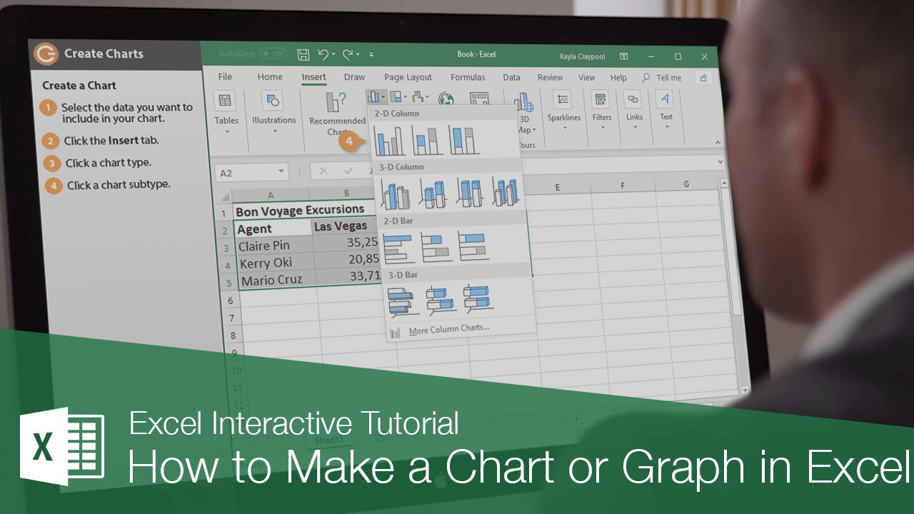
Create a Chart
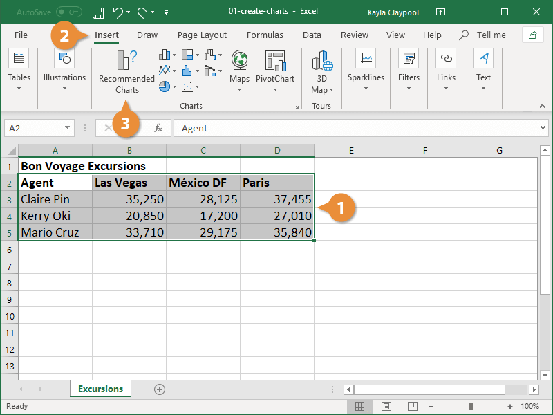
- Select the data you want to include in your chart.
Make sure to include your column names if you want them to be in the chart.
- Click the Insert tab.
- Select a chart type in the Charts group.

To see all available chart types click the Charts dialog box launcher. The Insert Chart dialog box appears, displaying every chart type that is available.
- Click a chart subtype.
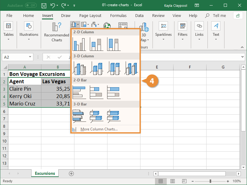
The chart appears in the worksheet and the Chart Tools appear on the Ribbon. The Chart Tools include three new tabs—Design, Layout and Format—that help you modify and format the chart.
Create a Recommended Chart
Many times, it’s hard to tell what type of chart will best illustrate your data. To help make your decision easier, Excel offers Recommended Charts. This tool looks at the data you have selected and suggests a few charts that will represent it well.
- Select the data you want to include in your chart.
- Click the Insert tab.
- Click Recommended Charts.
Excel recommends charts based on the data you selected.
- Select the type of chart you want to use.
Once you select a chart, a preview and description appear at the right.
- Click OK.
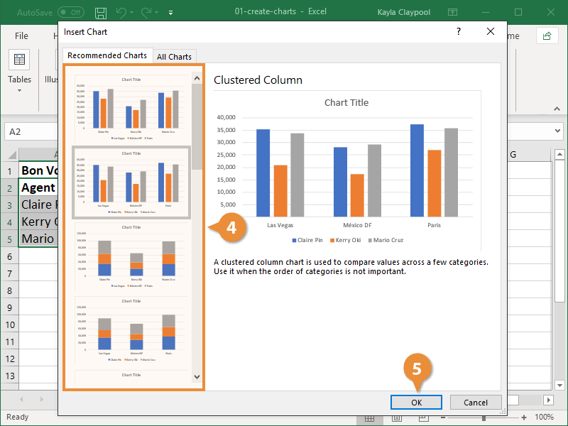
The recommended chart is inserted into the worksheet.