
Tutorial interactivo
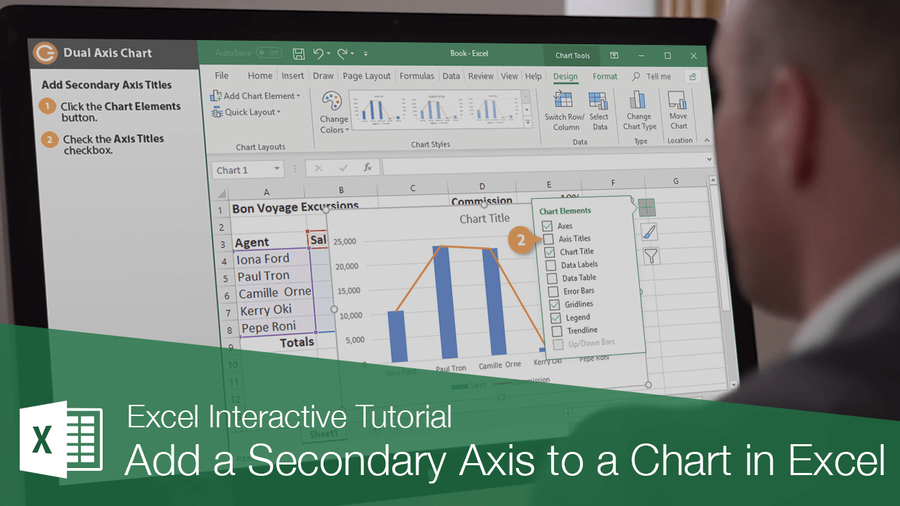
How to Add Secondary Axis in Excel
Add a Secondary Axis in Excel Charts to Display and Compare Multiple Data Sets with Different Scales
-
Aprender haciendo
-
LMS listo
-
Obtenga certificados

Pruebe este curso con una prueba gratuita
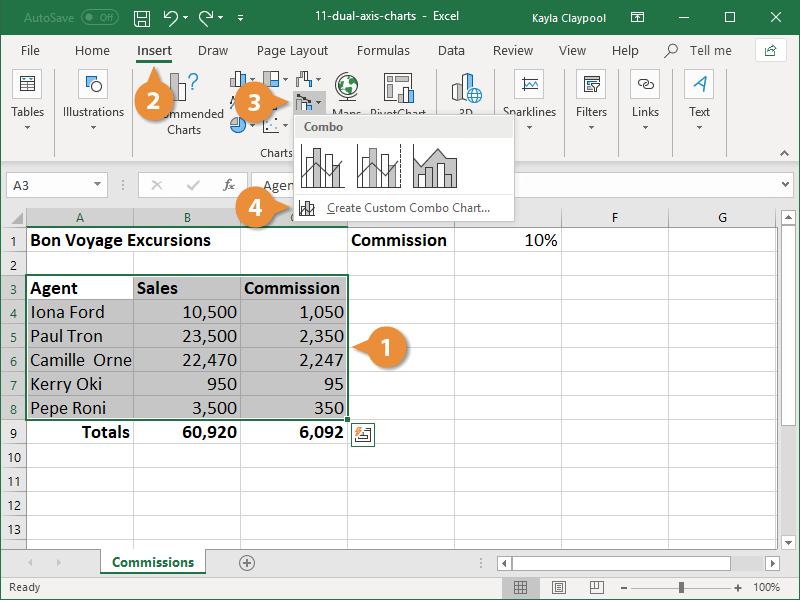
Dual axis charts, also called combo charts, are great when you have two different kinds of information to present in the same chart. For example, you can have a column chart representing sales data and a line chart representing commission amounts displayed together.
Create a Dual Axis Chart
- Select the data you want to include in the chart.
- Click the Insert tab.
- Click the Combo button.
- Select Create Custom Combo Chart.
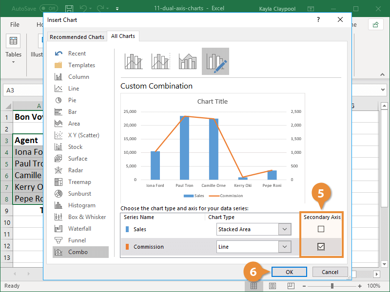
The default combo chart doesn’t include a secondary axis to label the values of the second data set. It’s best to turn this on to make the data clear for chart viewers.
- Click the Secondary Axis box for the data you want to display on the alternate axis.
You can change the chart type for each series to anything you want. Use the menus in the Chart Type column to select the chart types you want to use.
- Click OK.
Add Secondary Axis Titles
By default, the primary and secondary axis values are not labeled in the chart. Adding labels helps clarify the data being presented.
- Select the dual axis chart.
- Click the Chart Elements button.
- Select the Axis Titles check box.
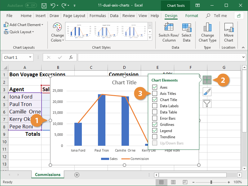
- Type a name in each axis text box.
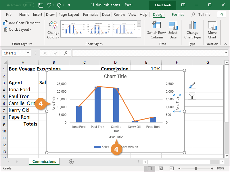
The primary and secondary axis titles are added to the chart.