
Interactive Tutorial
How to Edit a Legend in Excel
Learn How to Edit and Customize Chart Legends in Excel to Improve Clarity and Data Presentation
-
Learn by Doing
-
LMS Ready
-
Earn Certificates

Try this Course with a Free Trial
Besides using built-in chart layouts, you can manually add or edit individual chart labels such as the chart title or axis titles.
Change the Chart Title
The chart title often appears above the chart and is used to describe the data that’s being presented. You can add a completely new chart title or simply change the text of an existing one.
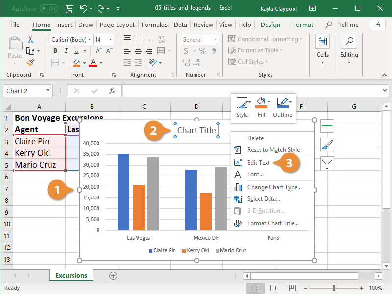
- Select the chart.
- Right-click the chart title.
- Click the Edit Text button.
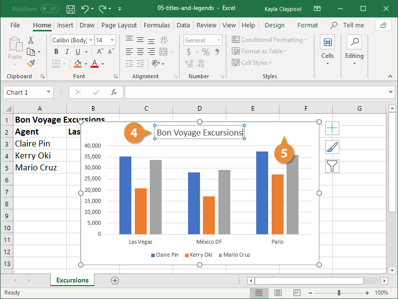
Double-click the chart title to make it editable.
- Enter the new chart title.
- Click anywhere outside the title area.
Add Axis Titles
The axis titles describe for viewers the category of data that’s being represented. Without them, it can be difficult to accurately portray information.
- Select the chart
- Click the Chart Elements button.
Hover the mouse over the label options in the list to preview them on your chart before making your selection.
- Select the Axis Titles check box.
A text box is added for both the vertical and horizontal axes.
- Enter descriptive axis titles.
- Click outside the title area.

Position the Chart Legend
Usually when a chart is created, a legend is added automatically. The legend identifies what information is portrayed in the chart’s plot area.
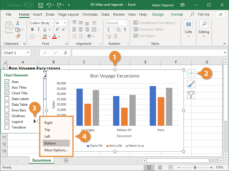
- Select the chart
- Click the Chart Elements button.
- Click the Legend button.
Be careful not to click the word “Legend” or it will turn it off, just hover over it until the list arrow appears.
- Select a position for the legend.
You can also click the Add Chart Element button on the Design tab.
Chart Elements
Chart and axis titles are just a couple of the chart elements that are customizable. This table describes everything you can modify.
| Chart Element | Description |
|---|---|
| Axes | Identifies the values being charted. Most charts have a vertical and horizontal axis. |
| Axis Titles | Provides a descriptive label for the data being charted on the axis. |
| Chart Title | Describes the data being presented in a chart. |
| Data Labels | Displays data from the cells of the worksheet on the plot area of the chart. |
| Data Table | A table added next to the chart that shows the worksheet data the chart is illustrating. |
| Error Bars | Helps you quickly identify standard deviations and error margins. |
| Gridlines | Horizontal and/or vertical lines added to a chart to make data easier to read. |
| Legend | The chart’s key. Describes the data being presented in the plot area of the chart. |
| Trendline | Identifies the trend of the current data, not actual values. Can also identify forecasts for future data. |