
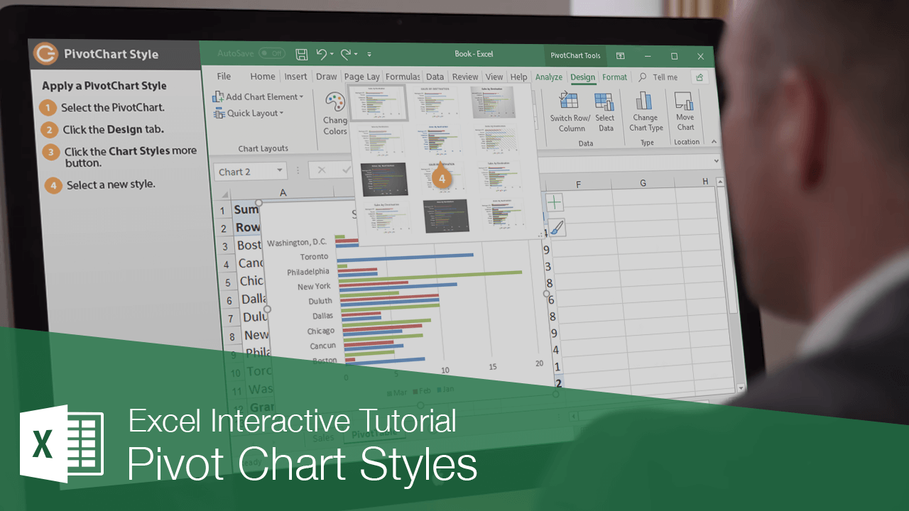
Interactive Tutorial
Pivot Chart Styles
Customize Pivot Chart Styles in Excel to Improve Readability and Create Professional Data Visuals
-
Learn by Doing
-
LMS Ready
-
Earn Certificates

Try this Course with a Free Trial
Built-in PivotChart styles allow you to adjust the format of several chart elements all at once. Styles allow you to quickly change colors, shading, and other formatting properties.
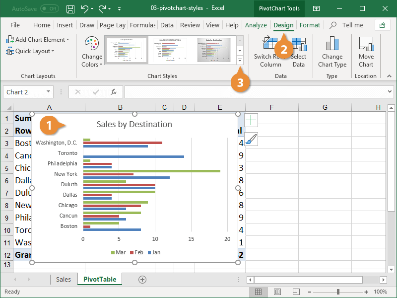
Apply a PivotChart Style
- Select the PivotChart.
- Click the Design tab.
The Chart Styles group of the Design tab shows a few of the available styles. You’ll have to expand the gallery to see all the style options.
- Click the Chart Styles More button.
A gallery appears displaying all the available chart styles. The styles available in the gallery will vary depending on the type of PivotChart you’re using.
- Select a new style.
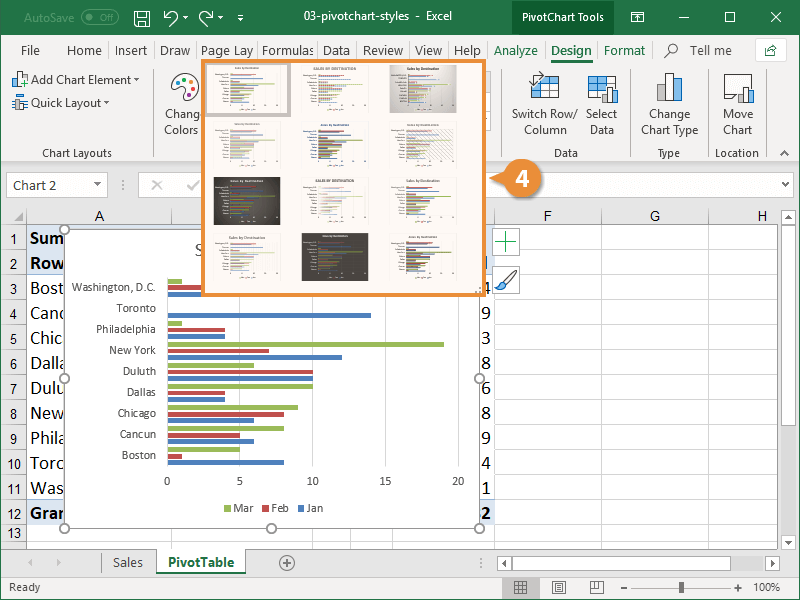
The new style is applied to the PivotChart.
Change Chart Colors
If you like a PivotChart style but not the colors that come with it, you can choose a different color scheme.
- Click the Change Colors button on the Design tab.
A menu of color schemes displays. The color options are broken into two categories: Colorful and Monochromatic. You can hover over an option in the menu to see what it will look like before selecting it.
The color schemes in the list coordinate with the theme that’s applied to the workbook.
- Select a new color set.
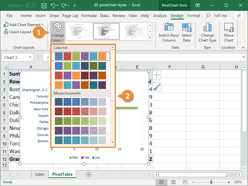
The new colors are applied to your PivotChart.