PowerPoint Charts
How to Add Charts in PowerPoint

PowerPoint Training Features:
-
Interactive bite-sized lessons
-
Get Certified
-
Accurate skill assessments
-
Customizable, LMS-ready content

Use a chart when you want your audience to easily understand a large quantity of data and the relationships between parts of the data. A chart is often much better at presenting information visually than hard-to-read numbers in a table.
| Chart Types | |||
|---|---|---|---|

Column |
Column charts are used to compare different values vertically side-by-side. Each value is represented in the chart by a vertical bar. | ||

Line |
Line charts are used to illustrate trends over time. Each value is plotted as a point on the chart and is connected to the other values by a line. | ||

Pie |
Pie charts are useful for showing values as a percentage of a whole. The values are represented by different colors. | ||

Bar |
Bar charts are just like column charts, except they display information in horizontal bars rather than in vertical columns. | ||

Area |
Area charts are similar to line charts, but the area beneath the lines is filled in. | ||

XY(Scatter) |
Scatter charts are used to plot clusters of values using single points. Multiple items can be plotted by using different colored points or different symbols. | ||

Stock |
Stock charts are effective for reporting the high and low points of stock prices or other values that tend to fluctuate within a range. | ||

Surface |
A surface chart is useful for finding the best combination of two sets of data. | ||

Radar |
Radar charts compare the aggregate values of a number of data series. | ||

Combination |
Combination charts show both a clustered column and line chart to compare values and data trends. | ||
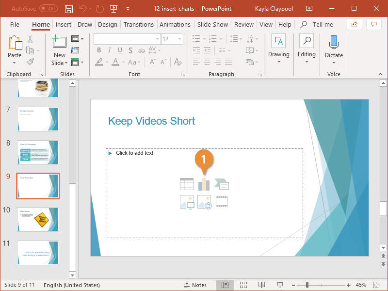
Insert a Chart
- Click Insert Chart in the content placeholder.
If you don’t have an empty placeholder on the slide, you can click the Insert tab and then click the Chart button in the Illustrations group.
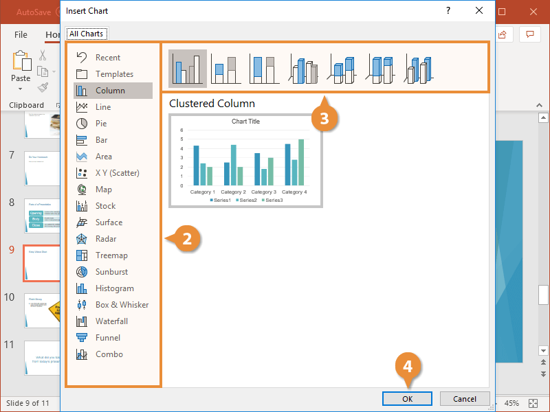
The Insert Chart dialog box appears.
- Choose a category.
- Select a chart type.
- Click OK.
The chart is inserted along with a spreadsheet.
- Use the Excel spreadsheet to enter the chart data.
To add or remove sections of data to your chart, click and drag any of the selection handles in the spreadsheet to change what’s included.
- Close the spreadsheet.
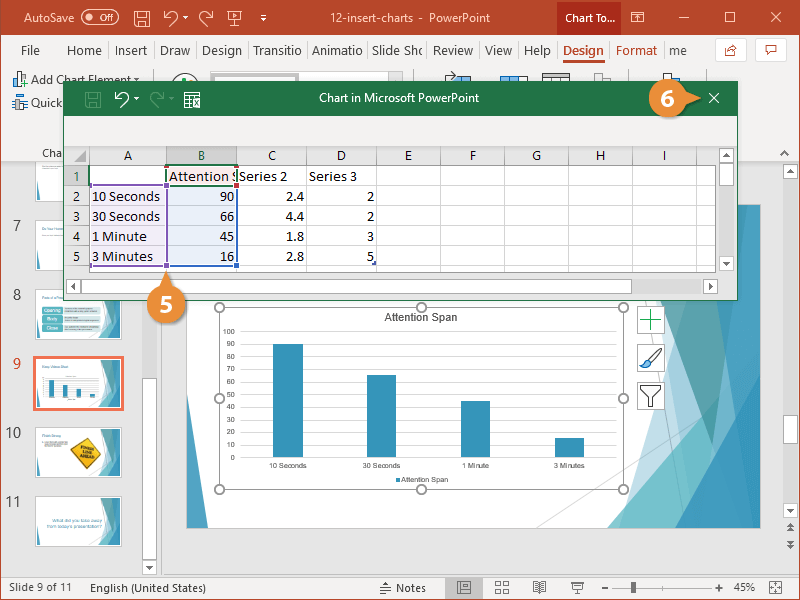
To reopen the spreadsheet and edit a chart’s data, select the chart, click the Design tab on the ribbon, then click the Edit Data button in the Data group.
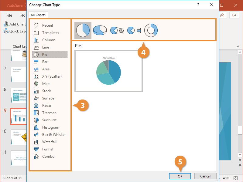
Change the Chart Type
Different types of charts are better for presenting different types of information. For example, a column chart is great for comparing values of different items, but not for illustrating trends or relationships. If you find that a chart you’ve created isn’t the best fit for your data, you can switch to a different chart type.
- Select the chart.
- Click the Change Chart Type button on the Chart Tools Design tab.
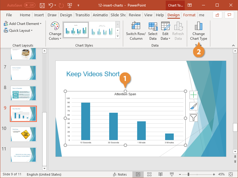
You see all available categories at the left.
- Choose a category.
- Select a chart type.
- Click OK.
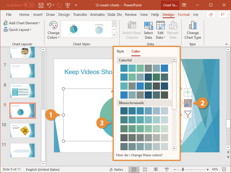
Format a Chart
There are a number of formatting tools available to change the look of your chart and modify elements for the chart type you chose. The options to format are available on the Chart Tools Design and Format tabs, but you can also use the Chart Tools shortcuts that appear to the right of a chart when it’s selected.
- Select a chart or chart element.
- Click the Chart Styles button.
- Select a style or color option.
- Chart Styles: Change the overall visual style of the chart.
- Chart Colors: Select from an array of color schemes designed to coordinate with the current presentation theme.
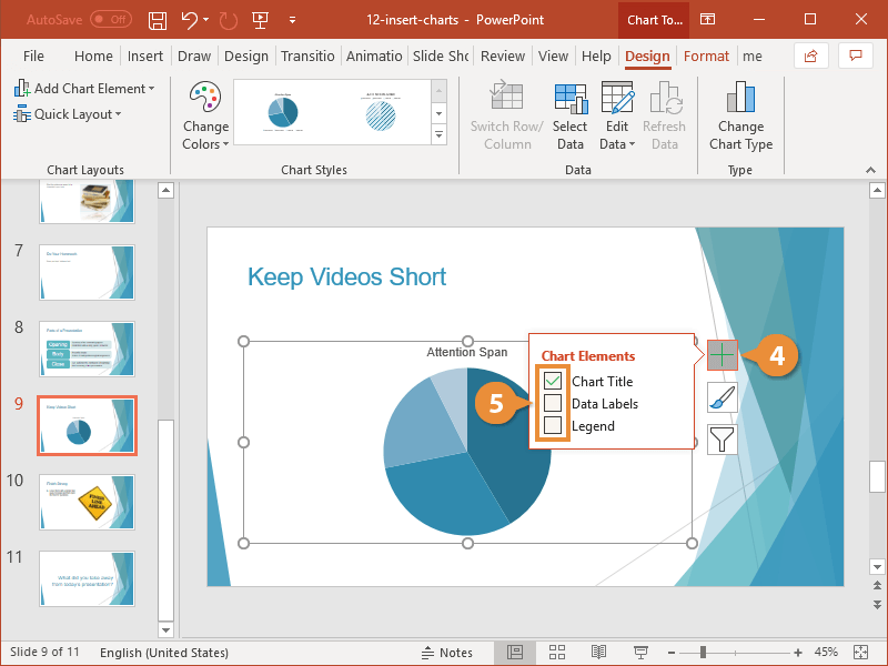
- Click the Chart Elements button.
This is where you add or remove things like titles, labels, and the legend. What you see here will vary depending on the type of chart you have inserted.
- Turn the chart elements on or off.

FREE Quick Reference
Click to DownloadFree to distribute with our compliments; we hope you will consider our paid training.
- LinkedIn-ready certificate
- Skill assessments
- Bite-sized, interactive lessons
- Saved progress