
Interactive Tutorial
Google Sheets Chart
Visualize Your Data with Charts and Graphs in Google Sheets for Clear Insights
-
Learn by Doing
-
LMS Ready
-
Earn Certificates

Try this Course with a Free Trial
Charts are a great way to share data and information in a graphical way. The foundation of charts is the data they illustrate. Choosing the right data is the first and most important step in creating a chart.
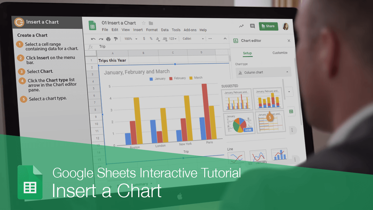
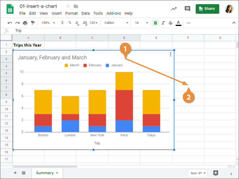
Create a Chart
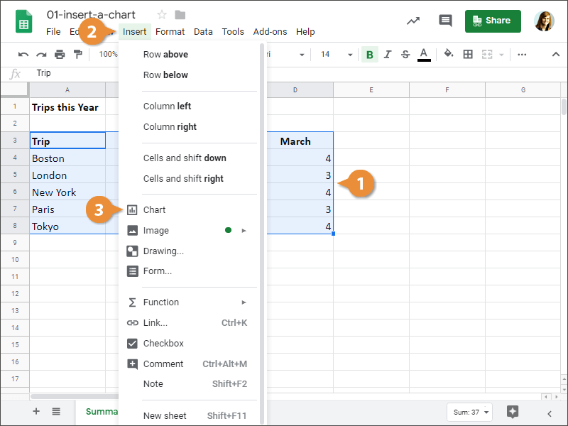
- Select a cell range containing data for a chart.
Make sure to select column names too, if you want those to be included.
- Click Insert on the menu bar.
- Select Chart.
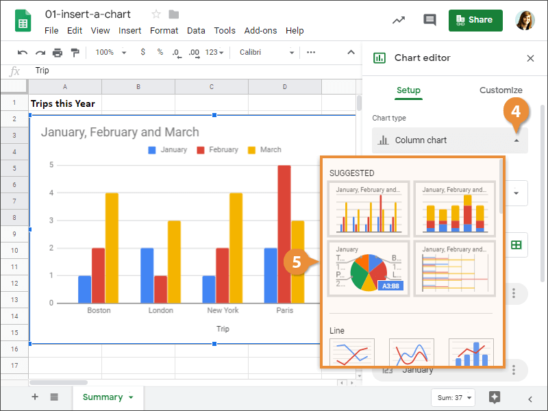
A chart is inserted with some default settings, and the Chart editor pane appears on the right.
- Click the Chart type list arrow in the Chart editor pane.
The chart types are split into several categories. The first category is Suggested, which will show several chart types that work best for the selected data.
Below the Suggested category, you can see other chart categories, starting with basic ones like line, area, and column. Further down the list you'll see more specialized types of charts.
- Select a chart type.
Once you've determined the results you want your chart to display, choose the chart that best suits this purpose. The most popular charts are column, line, pie, and bar charts.
The chart appears in the spreadsheet.
| Chart Types in Sheets | |
|---|---|
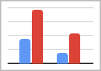 Column Column |
Column charts are used when you want to compare different values vertically side-by-side. Each value is represented in the chart by a vertical bar. If there are several series, each series is represented by a different color. |
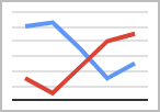 Line Line |
Line charts are used to illustrate trends over time. Each value is plotted as a point on the chart and is connected to other values by a line. Multiple items are plotted using different lines. |
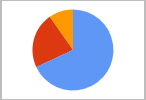 Pie Pie |
Pie charts are useful for showing values as a percentage of a whole. The values for each item are represented by different colors. Limit pie charts to eight sections. |
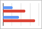 Bar Bar |
Bar charts are just like column charts, except they display information in horizontal bars rather than in vertical columns. |
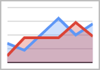 Area Area |
Area charts are the same as line charts, except the areas beneath the lines are filled with color. |
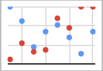 Scatter Scatter |
Scatter charts are used to plot clusters of values using single points. Multiple items can be plotted by using different colored points or different point symbols. |
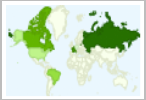 Map Map |
Map charts allows to create geographical maps from the selected data |
 Other Other |
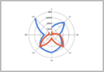
You can also create Waterfall, Histogram, Radar, Gauge, Scorecard, Candlestick, Organizational, Tree map, Timeline, and Table charts in Sheets. |
Move a Chart
- Click the chart to select it.
- Click and drag the chart to a new location.
Resize a Chart
- Click the chart to select it.
- Click and drag the chart's sizing handles to resize the chart.
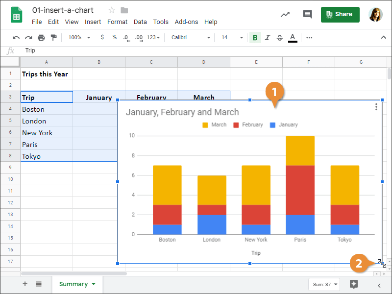
There! The chart is resized.