
Interactive Tutorial
How to Customize Chart in Google Sheets
Edit Chart Titles, Labels, and Legends in Google Sheets to Make Your Data Stand Out
-
Learn by Doing
-
LMS Ready
-
Earn Certificates

Try this Course with a Free Trial
Once you've inserted a chart into a sheet, you can make various changes to it. You can change the chart type, switch rows and columns, change a chart's title, and change a chart's legend.
Modify a Chart
Once you've inserted a chart into a sheet, you can make changes to it.
- Click the chart to select it.
- Click the More icon.
- Select Edit chart.
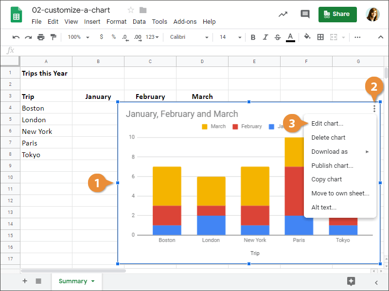
The Chart editor pane appears. This is where you can make changes to your chart.
Change Chart Type
Different types of charts are better for presenting different types of information. For example, a column chart is great for comparing values of different items, but not for illustrating trends or relationships. If you find that a chart you've created isn't the best fit for your data, you can switch to a different chart type.
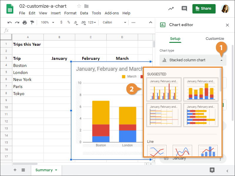
The chart type is changed.
Switch Rows and Columns
You can switch the rows and columns of data in a chart so they appear in opposite positions.
- Click the Switch rows / columns box in the Chart editor pane.
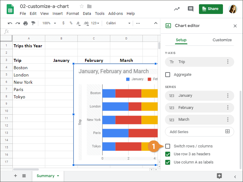
The data in the spreadsheet's rows and columns is flipped.
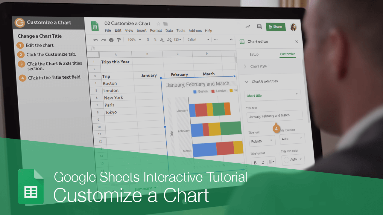
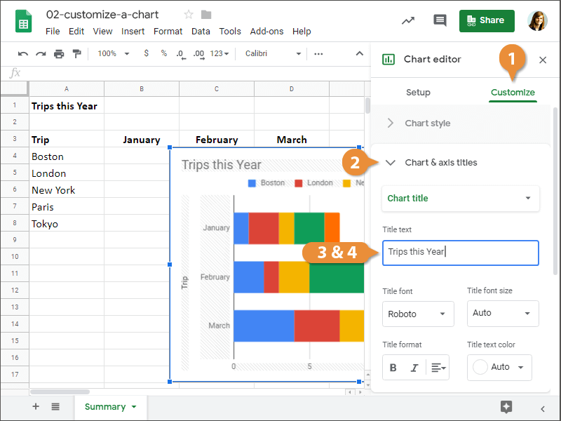
Change a Chart Title
The chart title often appears above the chart and is used to describe the data that's being presented. You can add a completely new chart title or simply change the text of an existing one.
- Click the Customize tab in the Chart editor pane.
- Click the Chart & axis titles section to expand it.
- Click in the Title text field.
- Enter a chart title.
Change a Chart Legend
You can also change your chart's legend.
- Click the Customize tab in the Chart editor pane.
- Click the Legend section to expand it.
- Specify the legend options.
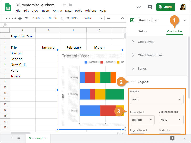
The legend is updated and we've finished making changes to the chart.