

How to Insert Charts in Google Slides
Create and Customize Charts in Google Slides to Present Data Visually and Professionally
Try this Course with a Free Trial


Chart Types
Use a chart when you want your audience to easily understand a large quantity of data and the relationships between parts of the data. A chart is often much better at presenting information visually than hard-to-read numbers in a table.
| Chart Types | |
|---|---|
 Column Column |
Column charts are used to compare different values vertically side-by-side. Each value is represented in the chart by a vertical bar. |
 Line Line |
Line charts are used to illustrate trends over time. Each value is plotted as a point on the chart and is connected to the other values by a line. |
 Bar Bar |
Bar charts are just like column charts, except they display information in horizontal bars rather than in vertical columns. |
 Pie Pie |
Pie charts are useful for showing values as a percentage of a whole. The values are represented by different colors. |
Insert a Chart
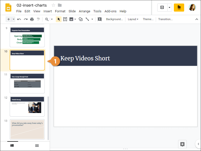
- Select the slide you want to add a chart to.
- Click Insert on the menu bar.
- Select Chart.
- Select a chart type.
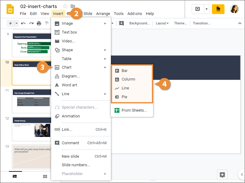
A chart is inserted with some placeholder data.
Edit a Chart
Once your chart is inserted and you have your own data you want to use, you can edit the chart to replace its data.
- Select a chart.
- Click the Linked chart options button.
- Select Open source.
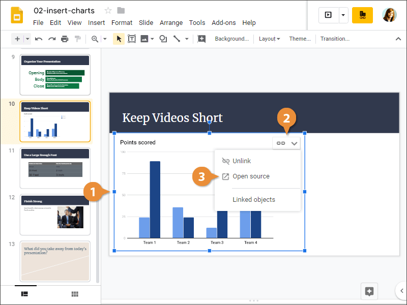
A spreadsheet opens up in the Google Sheets app, where you can enter your own data for the chart. You can also see the chart below the data.
- Edit the chart in Sheets.
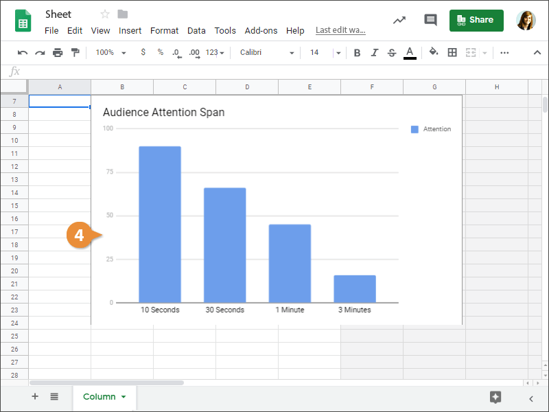
- Click the Update button for the chart in Slides.
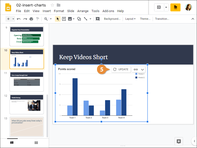
The chart is updated.
- Edit the chart in Sheets.