Interactive Tutorial
Captivate Button
Add interactive buttons to guide navigation and engagement in Adobe Captivate courses
-
Learn by Doing
-
LMS Ready
-
Earn Certificates

Try this Course with a Free Trial
Adding buttons to a slide in a Captivate project adds interactivity, and the multiple types of buttons available give you several ways to style those interactions.
Insert a Button
- Click the Interactions button on the toolbar.
- Select Button.
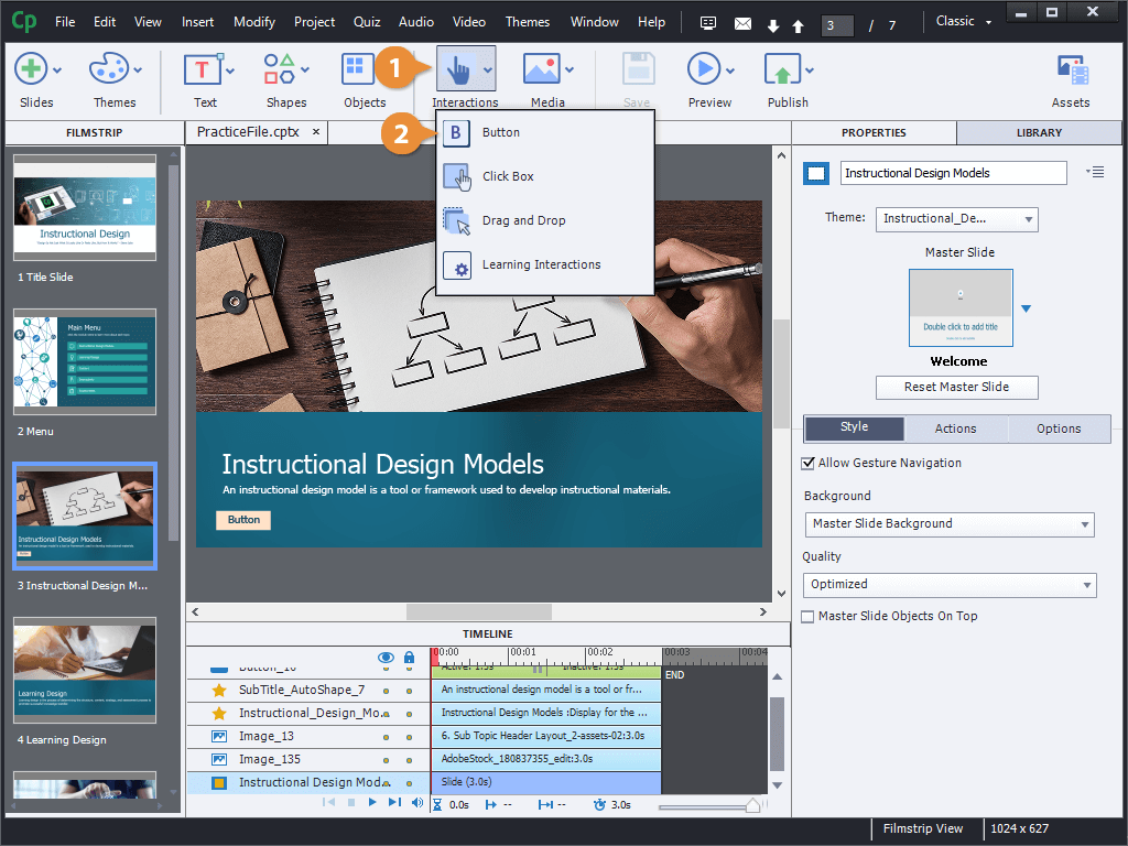
A new button is placed on the slide.
Change the Button Type
New buttons like this one always start as a Text Button, consisting of a bit of text in a box. You can switch to another button type to have some more ways to customize its appearance.
- Select a button.
- Click the Style tab in the Properties panel.
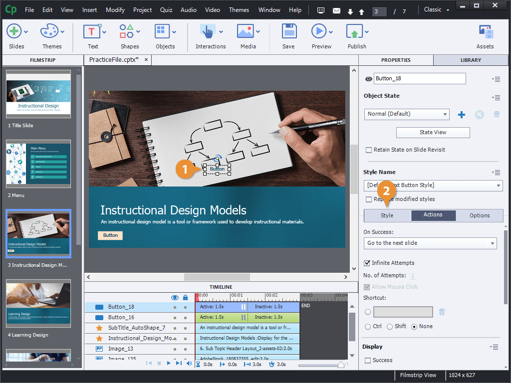
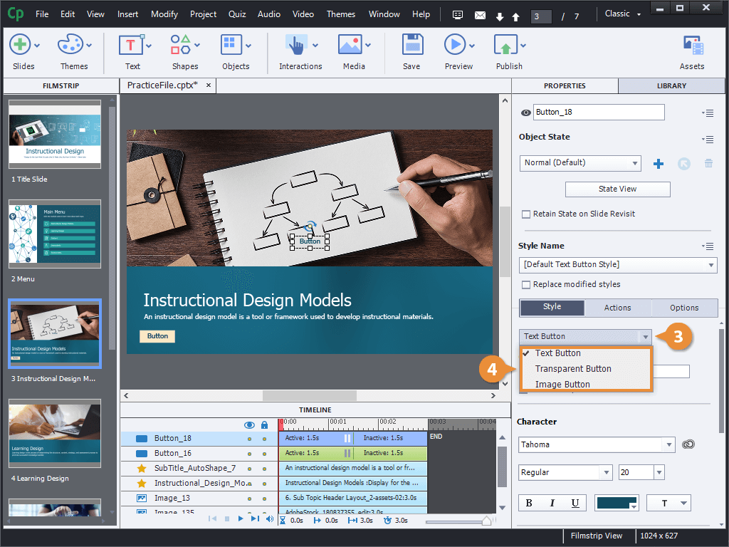
- Click the button style menu arrow.
The menu shows three different button types that you can choose from.
- Text Button: Lets you customize the style of the text, and choose whether to include either a plain grey background or a transparent one.
- Transparent Button: Is similar to a text button, with the same text formatting options, but also allows you to customize the shape's fill and border.
- Image Button: Allows you to select an image to use as a button. You can also include alternate versions of an image to use for the button's rollover and down states.
- Select a button type.
The button type changes, and with it, the available options to customize it.
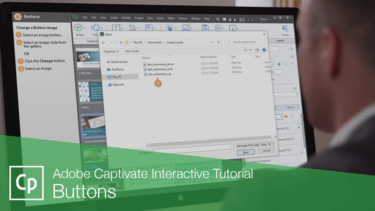
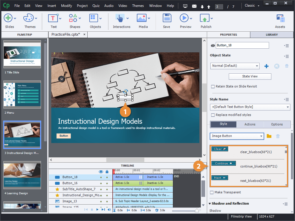
Change a Button Image
Image buttons can use some built-in styles, or images that you supply yourself.
- Select an image button.
- Select an image style from the gallery.
OR
- Click the Change button.
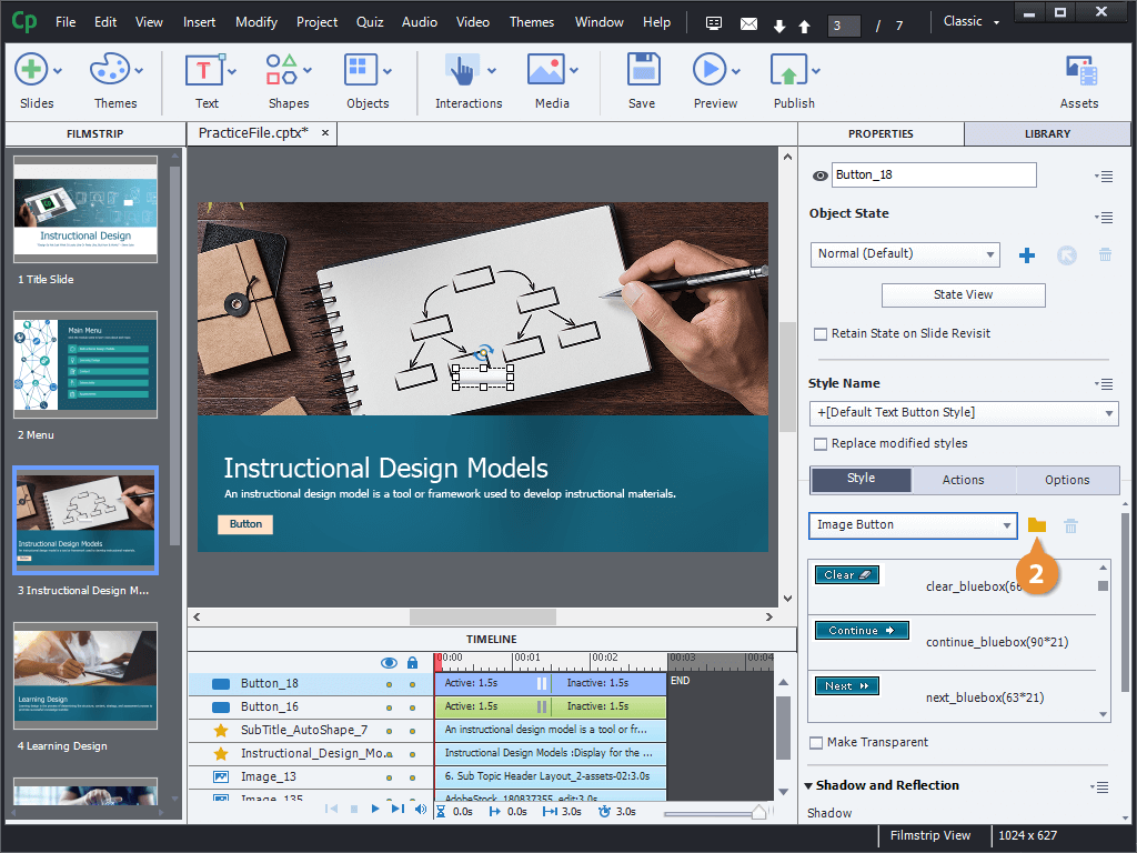
- Select an image.
- Click Open.
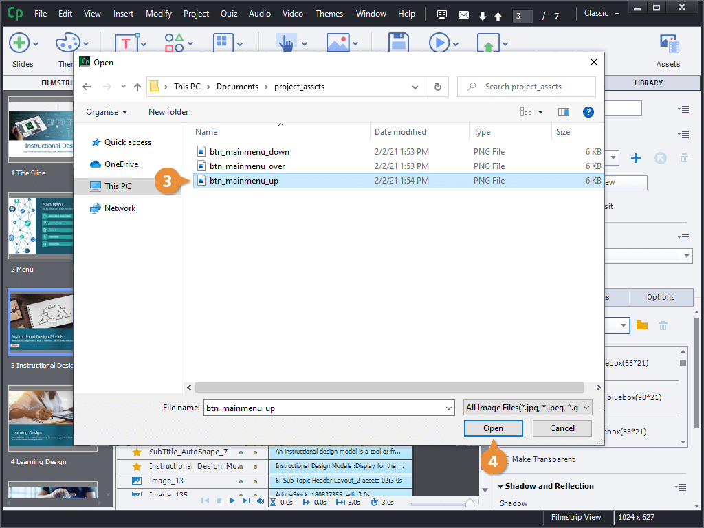
The file browser opens for you to select an image. You can select a single image to use as the button's regular appearance, but you can also use a set of images that will automatically be added as hover-over and down states, if they're named right.
The button changes to the selected image. That image is also added to the gallery, so that it's easier to use again elsewhere in your project.
Edit a Button's Style
You can change the appearance of the other types of buttons as well, by changing their text and shape formatting.
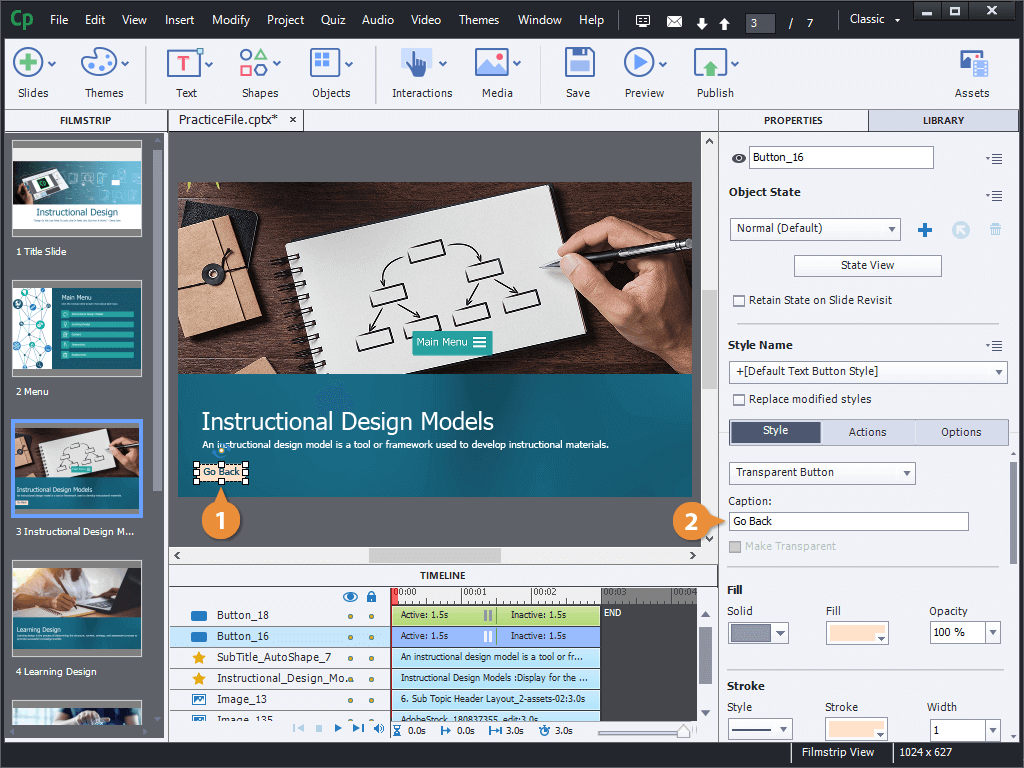
- Select a button.
- Edit the button's text.
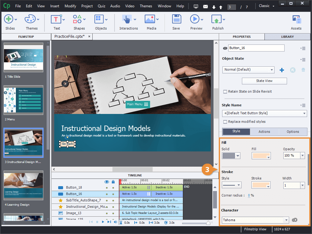
- Use the Style options to customize the button's fill, stroke, and text formatting.
You can change the appearance of the other types of buttons as well, by changing their text and shape formatting.
You can change the appearance of the other types of buttons as well, by changing their text and shape formatting.
Adjust Button Timing
Buttons also have some special timing properties, like automatically pausing a slide while waiting for user input.
- Click and drag a button's pause point on the timeline.
OR
- Click Window on the menu bar.
- Select Timing Properties.
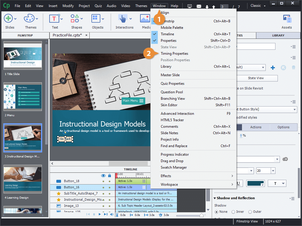
- Edit the timing in the Pause After field.
- Uncheck the Pause After checkbox.
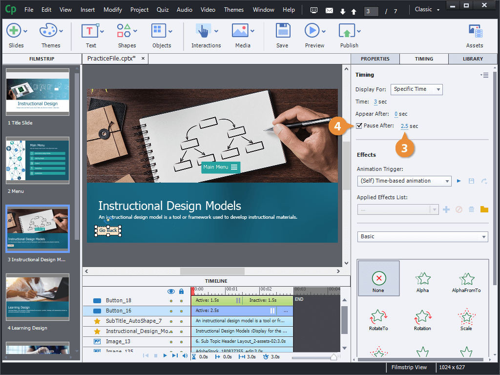
The Pause After options here control the pause point. You can adjust when it pauses using the text field here.
The pause point is removed from the selected button.
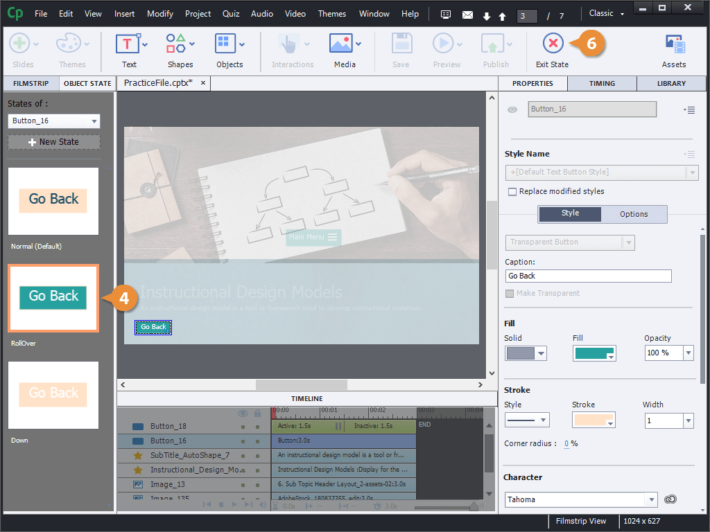
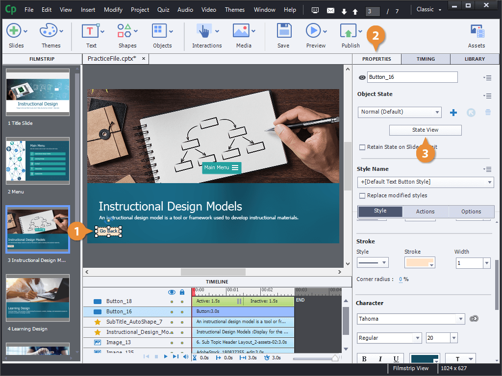
Edit Button States
One last thing to look at with buttons is the different button states. These states represent how a button looks normally, when the mouse cursor is hovering over it, and while clicked.
- Select a button.
- Click the Properties tab.
- Click the State View button.
The Object State panel appears on the left, showing the different states of the button:
- Normal state: How the button will look most of the time, when it's not being interacted with.
- RollOver state: How the button will appear while the mouse cursor is hovering over it, but not clicking.
- Down state: How the button will look while being clicked by the mouse.
- Click a button state.
- Edit a button state's formatting and add new elements.
- Click the Exit State button.